inclusiveOCW - comments and feedback
| Issue | Priority | Progress | Notes | SWIK | |
|---|---|---|---|---|---|
Presentation mode | |||||
Presentation mode (navigation) are not accessible by screen readers even in chrome Presentation mode: no cursor interaction in slides possible (to read out line by line). However there the form-field are in a clickable mode | High | This issue is caused by the need to have role=application within the presentation mode to allow all users to use keyboard shortcuts to control the presentation. This is a know issue with presentation slideshow tools (see https://github.com/shower/shower/issues/220 for discussion of the same issue on an open source presentation library). Currently a screen reader user who was presenting with SlideWiki can use left/right or spacebar to move through the slides and will hear a summary of each slide when it loads. We are adding a region to wrap each slide and this will be labelled with the slide title which may help navigation. Although not always consistent we have found the following behaviour with JAWS and IE/Firefox:
We are also looking into whether we can adapt the overview mode to provide a view without the application role which would show all the slides. | SWIK-2222 - Getting issue details... STATUS | ||
The need to use the URLs to navigate to a specific slide | Medium | fixed in the new version | |||
Zoom in and out does not work as intended. If the slide is full with text and image, when zooming in the navigation buttons are enlarged while the slide content are still the same size. | High | Need to provide guidance in the help files. This is fixed sized content so not possible to zoom (and allowed under | |||
Ease of use with ZoomText 11 Navigation with arrow keys work. Generally, the focus to move to the next slide, changed i.e. the focus is on the arrow keys he remains there and users at large magnification not detect whether the change has taken place (certainly a common scenario, if the slides) be read from top to bottom) | This would impact the screen reader experience as well. Would having a shortcut key to focus on the top of the slide be sufficient? | SWIK-1365 - Getting issue details... STATUS | |||
Is it possible to have a footer and numbering for the slides? | Medium | Done in the new version | |||
Proposal: In the presentation view, adjustable much like in PowerPoint | At the moment we are not planning to have an auto-play function in the presentation mode | ||||
| Deck view mode | |||||
| The control bar (slide navigation, print, share ...) is available only below the slide which makes it hard to reach with screen readers (https://slidewiki.org/deck/109716-2/projekt-inclusiveocw/slide/714602-19/714602-19:1/view) | Medium | Play button now in the decktree. Will improve landmarks | |||
| In the control bar of the slides, the screen reader reads the slide number navigation as "Slide number", in the control bar, without the number of the slide in focus. It is prefered to read "Slide number 5" https://slidewiki.org/deck/81800-3/slide/444023-3/444023-3:12/view | Medium | ||||
| There is a large white space between the slides and the control bar on the mobile version. This white space is misleading and gives the impression when using screen readers that there are no more links downwards. | Medium | SWAQ-426 - Getting issue details... STATUS | |||
| The generated PDF file is different from the original slides (sometimes text overlaps and sentences are not complete | Medium | ||||
| Searching Function | |||||
| After clicking the search button, the focus should go to the results, however, the focus is kept on the search form which gives the impression that no results were provided | High | SWIK-2486 - Getting issue details... STATUS | |||
| Too many results appear and some of them are not related (especially when using two terms). It's hard to navigate through a long list. | Medium | ||||
| The search result includes decks and slides. Would it be better to only include decks? This would make the results less confusing | Medium | ||||
| Search button couldn't be found on mobile version with the screen reader (it's there in the menu but it is labeled "SlideWiki logo" rather than search). | Medium | ||||
Why decks and slides appear in the search results colourful mix? [AJ1] | Currently working on improving search results. When we add subject categories to decks, you will be able to filter the search results by category and education level. | ||||
| Edit mode | |||||
| There is a lot of templates, which make it a bit confusing which one to select. | Medium | ||||
| When using a screen reader, it is hard to recognize where is the cursor to edit text. It is preferred when focusing on the slide editor to hear something like "this is the edit box title, or edit box content,..." | High | SWIK-406 - Getting issue details... STATUS | |||
| When you upload an image it's positioned over text. The overlap of an image and text cannot be recognized by a screen reader. Is it possible to fix a position for an image when it is uploaded or there might be a tip like "use images in empty slides, not accompanied with text" | Medium | ||||
| Importing slide | |||||
| Some images didn't appear when importing ppt files | |||||
| When there are tabs in the original ppt (used for formatting slides), they are not rendered correctly when they are imported in SlideWiki | |||||
| Keyboard access | |||||
WCAG-Success Criterion 2.4.7 Focus Visible. Any keyboard operable user interface has a mode of operation where the keyboard focus indicator must be visible. For example, put a red pointed frame around the focus | High | 20181122 Das Problem besteht weiterhin, z.B. auf der Startseite ist der Tastaturfokus nur schwer oder gar nicht erkennbar. Getestet mit Chrome und FF The problem persists, e.g. on the start page, the keyboard focus is difficult or impossible to recognize. Tested with Chrome and FF | SWIK-2494 - Getting issue details... STATUS SWIK-2606 - Getting issue details... STATUS | ||
WCAG-Success Criterion 2.1.1 Keyboard. All functionality of the content is operable through a keyboard interface without requiring specific timings for individual keystrokes, except where the underlying function requires input that depends on the path of the user's movement and not just the endpoints. Page: https://slidewiki.org/ (Build c85e59f@r2.8.x-VMU-EKDDA) Update: Build acd24a6@ - WCAG 2.1.1 "Sign in" ist nicht mit der Tastatur erreichbar, sondern nur mit der Maus Lösung: als richtigen Link a mit href anlegen "Activity Feed" ist tastaturbedienbar, obwohl es kein interaktives Element sondern eine Überschrift darstellt. <h5 class="ui small header" tabindex="0">Activity Feed</h5> Lösung: tabindex= "0" entfernen https://slidewiki.org/search?keywords=inclusiveocw&sort=score "Advanced Options" Ausklappmenü ist nicht tastaturbedienbar Der Rahmen der einzelnen Einträge ist fokussierbar, jedoch ohne Aktion, dieser kann aus der Fokusreihenfolge entfernt werden. Lösung: tabindex="0" entfernen | High | SWIK-2329 - Getting issue details... STATUS SWIK-1091 - Getting issue details... STATUS SWIK-1994 - Getting issue details... STATUS | |||
WCAG-Success Criterion 2.1.2 No Keyboard Trap. If keyboard focus can be moved to a component of the page using a keyboard interface, then focus can be moved away from that component using only a keyboard interface, and, if it requires more than unmodified arrow or tabkeys or other standard exit methods, the user is advised of the method for moving focus away. Page: https://slidewiki.org/ (Build c85e59f@r2.8.x-VMU-EKDDA) | High | SWIK-1951 - Getting issue details... STATUS SWIK-406 - Getting issue details... STATUS | |||
| Language | |||||
WCAG-Success Criterion 2.4.4 Link Purpose (In Context). The purpose of each link can be determined from the link text alone or from the link text together with its programmatically determined link context, except where the purpose of the link would be ambiguous to users in general. Page: https://slidewiki.org/ (Build c85e59f@r2.8.x-VMU-EKDDA) Page: https://slidewiki.org/deck/108227-1/einfuhrung-in-die-kommasetzung/slide/706745-1 (Build c85e59f@r2.8.x-VMU-EKDDA) | High | ||||
So far only language for entire presentation possible, single words or blocks of text in another language are not taken into account and thus incorrectly read. Proposal: Embed the language choice for individual slides and text within slides (text box level)[AJ3] | We will be adding language tags at the slide level as part of our translation feature. At the moment it is only possible to change the language on text within a slide by editing the HTML but I will explore if there are other options. | SWIK-2591 - Getting issue details... STATUS | |||
| Ease of use with JAWS 18 | |||||
| "Insert + F7" too long, not usefully applicable | Difficult to manage as each slide is a link so there are many links in each deck. Will discuss with the development team | ||||
| "Insert + F6" can be used for navigation, constraint, see below | |||||
| Heading list although lists headings, but E.g. a just called deck associated with not the area of the page, located generally on a 3-split-page, it is possible, that in each of the three columns a heading with the same name stands, it appears so three times in the list without it being known what title you just select. Generally the heading list of heading 2 starts, there is no heading 1 The page is divided into regions, which is not announced but mostly of JAWS. If you know that, it is super. The areas can jump in with "R" and with insert + CTRL + R list. This is very good for navigation. Proposal: Rename headings in order to recognize where Area/region they belong | Heading 1 should be applied to the link to the SlideWiki homepage (on the SlideWiki logo). This is a bug and will be fixed The heading structure is designed that the deck title is Heading 2 and the slide title is Heading 3. We can add aria labels (hidden from the UI) to add a description to these headings. The structure of lower headings needs to be improved over the next sprint. | SWAQ-446 - Getting issue details... STATUS | |||
Proposal: Jump-to links work "Slideinformationen", for "Start presentation" for "Edit slide", E.g. that would be helpful also a shortcut key to start Presentation, this makes the operation faster in comparison to the use of the form field list "insert + F5" | Abi: We can look at adding an access key but we need to make sure they do not interfere with screen readers if you have suggestions for: Would it also be helpful to have a shortcut key to jump to the slide content? BFW: We looked for easy to handle access keys and found the following, |
SWIK-2271
-
Getting issue details...
STATUS
| |||
| List box for text-to-speech [AJ1] (after switch "add deck") not named and not be operable, List box for the sorting not usable (after heading "Search Results") | Currently dropdown with autocomplete / typing is not accessible. We are currently working on fixing this as it affects many different screens. |
SWIK-1994
-
Getting issue details...
STATUS
SWIK-2047
-
Getting issue details...
STATUS
SWIK-1645
-
Getting issue details...
STATUS
SWIK-2484
-
Getting issue details...
STATUS
| |||
| Automatic read off the slides button is not found "next slide", it must be "Insert + 5" used to select switch, If read with "H" is enforced, JAWS recognizes the button "next slide". Confirm the button with spacebar works to move to the next slide (SPACEBAR is normal and ok, press enter in addition would be good) Graphics are partly not having read[AJ2] | At the moment, when you change slides in the presentation mode, the text content is automatically read aloud but this does not include alt text describing the graphics. It is possible to navigate through the slide content and read it all if you can get focus into the slide. We did force focus to be on the content of the slide items but we had negative feedback from non-screen reader users as the focus indicator was always visible. Abi: I want to work through this again with the developer to see if we could have something like a shortcut key to focus on the title. BFW: Another shortcut key would be a stopgap. You should be able to read the content of a slide easily. This also would help users of Zoom Text 11. Pressing the next slide button would bring the focus on top of the slight and the user can see this (currently he can’t recognize the change of the slide as the focus remains on the two arrows). We are also aware that in imported slide the reading order is often incorrect (as they are wrong in the imported slides). We are looking at whether we can force the title to the slide to be automatically at the top of the reading order. | ||||
The right arrow or left arrow keys used by JAWS to read character by character. Thus, the call to the next slide is only possible if this button is passed through before JAWS key 3. Proposal: E.g. alt + n for "next slide" and ALT + p for "previous slide" set.[AJ3] | If these shortcut keys are compatible with all screen readers we should be able to add them. | ||||
| On the last slide, the "next slide" is grey because there's no more slides. That is not recognised. He is also said as the black "next slide" button.[AJ4] | Abi: Would you like an announcement on the next slide button that there are no more slides available? Or would you prefer to have a final slide for example with a link returning to SlideWiki? BFW: An announcement “Next slide not available” would be ok. | ||||
Proposal: | We are just about to add translation options into the platform. We will look to set the language tag at a slide level which would tell JAWs what language to use. | SWIK-2294 - Getting issue details... STATUS | |||
| Application and supplement hot regions in full-screen mode, this designation is not managed. Videos on YouTube are not open in a new tab by default. If you for example with ALT + arrow left goes back, you are back on the first slide[AJ5]. Label the tabs with numbers is slightly annoying with the Speech output. If you have multiple tabs open, the orientation is difficult. When you switch with CTRL + tab JAWS reads the label that is on the registers[AJ6]. | Abi: Please, could you provide the provide the slide examples for these issues? YouTube videos may be embedded within the slide so ALT + arrow left would take you back to the previous slide. BFW: Videos on Youtube: Alt + arrow left / Alt + arrow right gets the user to the previous/next slide = OK | ||||
| Others | |||||
| Presentation room: this function is very useful as it allows the teacher to navigate through the slides and the students can follow him | High | SWIK-2256 - Getting issue details... STATUS | |||
| Misses/test decks, which cannot be deleted due to try out the various functions in the processing of decks, Proposal: Delete function for copyright of decks allow, prevent garbage on the platform | There is now an option under Deck Edit to change a deck to “unlisted”. This is removed from search results and you only see it in your lost of the deck if you select unlisted decks. New decks are unlisted until you choose to change the deck to “published” We will be adding a function to delete unlisted decks very soon. | SWIK-907 - Getting issue details... STATUS | |||
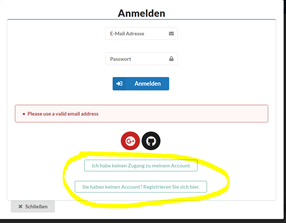
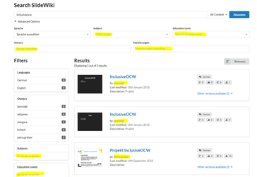
The color contrast is not good, ex. search text should be darker, the links at the footer section are not recognizable. (WCAG-Success Criterion 1.4.3 Contrast. The visual presentation of text and images of text needs a contrast ratio of at least 4.5:1) For example, search-field and footer-links have not enough contrast. Update: Build acd24a6@ - WCAG 1.4.3 Sprachauswahlschalter 4,15 statt 4,5 unfokussiert Kontrast in den grünen Kästen = 2,0:1 fokussiert noch schlechter https://slidewiki.org/search?keywords=inclusiveocw&sort=score Kontrast der markierten Stellen muss auf 4,5:1 erhöht werden Kontrast der markierten Stellen muss auf 4,5:1 erhöht werden | High | SWIK-2049 - Getting issue details... STATUS Checked colour contrast requirements in WCAG and links are sufficent as there is contrast with black text. | |||
| In the German SlideWiki version, some text is not translated like "search" | High | ||||
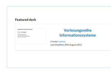
Headings Page: https://slidewiki.org/ (Build c85e59f@r2.8.x-VMU-EKDDA) Update: Build acd24a6@ - WCAG 1.3.1 <h1>+<h2> ("Willkommen bei SlideWiki" + "Learn more about SlideWiki") sind versteckt, jedoch für den Screenreader zugänglich. Könnten Diese beiden Überschriften für alle zugänglich gemacht werden? "Open educational resources for all learning environments" + "SlideWiki: Create, Share and Enjoy Presentations" beides als <h2> ausgezeichnet unterscheiden sich optisch jedoch stark voneinander <h3> "Featured deck" ist optisch der <h2> "Vorlesungsreihe Informationssysteme" übergeordnet, vielleicht sollte "Vorlesungsreihe Informationssysteme" nur als Link und nicht als Überschrift ausgezeichnet werden. "With SlideWiki you can:" + "Features coming soon:" = <h3> besser als <h2> auszeichnen, es gibt keinen Grund hier eine Überschriftenebene zu überspringen https://slidewiki.org/contactus "Kontaktanfrage" = <h2>, "Rückmeldung" = <h3> besser wäre beides eine Ebene anzuheben und auf der Seite mit <h1> zu starten. | High | SWIK-2298 - Getting issue details... STATUS | |||
WCAG-Success Criterion 2.4.1 Bypass Blocks. A mechanism is available to bypass blocks of content that are repeated on multiple Web pages. For example, it is possible to insert jump links at the top of the page to facilitate navigation on the page (navigation, presentation, deck information, footer ...) | High | ||||
WCAG-Success Criterion 2.4.2 Page Titled. Web pages have titles that describe topic or purpose. Page: https://slidewiki.org/ (Build c85e59f@r2.8.x-VMU-EKDDA) Page: https://slidewiki.org/deck/108227-1/einfuhrung-in-die-kommasetzung/slide/706745-1 (Build c85e59f@r2.8.x-VMU-EKDDA) | High | SWIK-2589 - Getting issue details... STATUS | |||
| Question: Is there a control similar to like in Wikipedia? There is a possibility of error/warning, if for example no heading is assigned to? | Meduim | We will be building an accessibility checker for the slide content in the next few months. | SWIK-2286 - Getting issue details... STATUS | ||
WCAG-Success Criterion 2.2.2 Pause, Stop, Hide. For moving, blinking, scrolling, or auto-updating information, all of the following are true. Moving, blinking, scrolling: For any moving, blinking or scrolling information that (1) starts automatically, (2) lasts more than five seconds, and (3) is presented in parallel with other content, there is a mechanism for the user to pause, stop, or hide it unless the movement, blinking, or scrolling is part of an activity where it is essential; Auto-updating: For any auto-updating information that (1) starts automatically and (2) is presented in parallel with other content, there is a mechanism for the user to pause, stop, or hide it or to control the frequency of the update unless the auto-updating is part of an activity where it is essential. The Feedback form success message, that is shown after submitting the form, closes automatically after 5 seconds. | High | ||||
WCAG-Success Criterion 1.3.1 Info and Relationships. Information, structure, and relationships conveyed through presentation can be programmatically determined or are available in text. Using standard text formatting conventions for paragraphs.
Update: Build acd24a6@ - WCAG 1.3.1 Hervorhebnungen "Provided as-is:", " Licensing:" sind mit <b> ausgezeichnet Lösung: statt <b> <strong> oder <em> verwenden | High | Resolved in footer. Deck Tree should have role=tree, then links=treeitem | SWIK-2578 - Getting issue details... STATUS | ||
WCAG-Success Criterion 1.1.1 Non-text Content Page: https://slidewiki.org/ (Build c85e59f@r2.8.x-VMU-EKDDA) Update: Build acd24a6@ - WCAG 1.1.1 verlinktes Vorschaubild hat keinen Aussagekräftigen Alternativtext (Feature image) Besser wäre es die Verlinkung zu entfernen, da der Link reduntant zum nebenstehenden Link (Vorlesereihe Informationssysteme) ist. Man kann das Bild auch als dekorative Grafik unverlinkt mit einem leeren alt-Attribut auf der Seite einbinden und aus der Fokusreihenfolge entfernen. | High | Partially supported through the background image option OR through adding null alt text (space in alt text field) | SWIK-2144 - Getting issue details... STATUS | ||
Question: there are corresponding versioning for the public version Proposal: Version number release, that facilitates the systematic | The platform build and release number is displayed in the bottom right hand corner of the page. The current release is Build c85e59f@r2.8.x-VMU-EKDDA | ||||
| Form field error messages are not accessible to screen readers | SWIK-1972 - Getting issue details... STATUS | ||||
1.4.1 Ohne Frabe nutzbar Links im Text sind farbig hervorgehoben, aber auf keine weitere Art wie unterstreichung oder Änderung bei Ffokussierung erkennbar. Lösung: Bei Fokus Unterstreichung hinzufügen, besser noch Links generell unterstreichen | |||||
| Feedback from Joannes Fischer | |||||
| The Forward/Back-Buttons miss alt-texts. A text should be added inside the <button>-elements | Forward/Back Buttons below the slide have appropriate aria-labels | ||||
There is an SVG-image in the same Link-element that also holds the username (of the creator) in the Creator field. The image should be hidden to a screenreader with aria-hidden=”true”. | |||||
| This is the link in the breadcrumb / navigation component. Need to consider if hidden H1 more appropriate | ||||
The current slide number in the lower right is read by the screenreader just as a number. It doesn’t become clear that this number indicates the number of the currently shown slide. An informative text should be added, i.e. sitting outside of the visible area of the page, that says something like “current slide:” or the attribute aria-current=”page” should be added to the element. | Need to clarify if this is the meta data or the number displayed between the forward/back slide controls. | ||||
“Search…” in the searchfield without focus has 1.3:1, with focus 1.9:1. It should be at least 4.5:1 for the better (w/ focus), 3:1 for the worse (w/o focus). For the search field the placeholder text is not sufficient for a screenreader. The accompanying label element is hidden for all users with the hidden-attribute. This hidden-attribute should be removed. | Placeholder text contrast Search field needs label | ||||
| Button below slide/deckview should have | SWIK-2592 - Getting issue details... STATUS | |||
| Unclear which navigation elements this is referring to?? Checked buttons and decktree - not spans | ||||
The main content, declared with <main> currently includes only the slides area. In any case the button bar below the slide area should be included in <main>. The area below (Sources, Tags ..) is not included in any page area. It should either be included in the <main> too or should be included in another page area (i.e. role=”complementary”). In the later case the heading level should be set so that it is on the same level as the other columns (Select language, Creator etc..) | |||||
Focus-Order after closing a modal dialog Landing page: When the button “Add deck” is pressed, there is a modal dialog displayed and the Tab-focus only moves inside this dialog. This is correct behavior. When the dialog was closed the focus should be back on the button that triggered the dialog before, it should not be back at the beginning of the page. Additionally the attribute aria-modal=”true” should be added to the top-most element of the modal dialog, so that also Cursor-Key-Navigation of a screen reader is kept within the modal dialog. | |||||
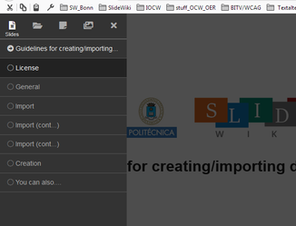
Presentation view: The Navigation-menu is a modal dialog because the rest of the page is dimmed when the menu is called. The Focus thus should also only move inside this menu. | This refers to the Reveal menu add in | SWIK-2329 - Getting issue details... STATUS | |||
| Deck view: There are elements for which it doesn’t make sense to include them in the focus-order, i.e. the “Published” tag, the Language tag, the label with the number of slides. Since they are not interaction elements they should not be reachable via Tab. | This is metadata tags. Published status remains in tab order | ||||
Name, Role, Value of interaction elements
| Dropdown menus and tab interface. Reported elsewhere. | ||||
