Slide Editor redesign
Background
Following on from feedback from trials and reviewers, we are looking to improve the usability of the slide editor functions. We need feedback on proposed changes!
The following parts of the editor need to be improved:
- adding, moving and re-sizing input boxes
- adding images and ensuring that aspect ratio is maintained when an image is first imported
- simplifying the editing tools
Proposal
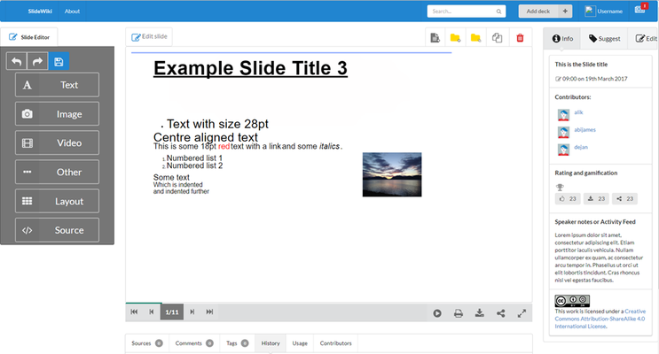
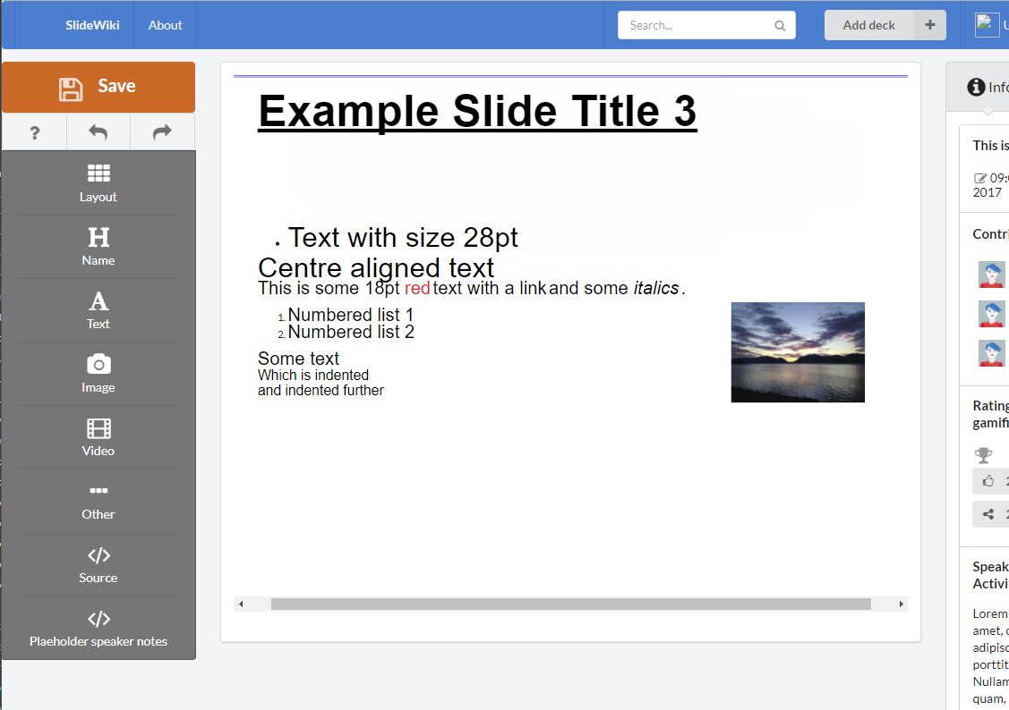
The proposal is to create an editing tool panel to replace the deck tree when editing the slide. Current functions above the slide for selecting a template will move to this panel. In addition adding an input box will be split into the following functions:
- add text box ---- this replicates the current add input box function
- add image ---- this will load the new image loader dialogue. Once an image is uploaded, a new input box will be added to the slide to the same same aspect ratio as the image, containing just the image
- add video — this will initiate an equivalent to the CKvideo add video function. Once video is selected a new input box is added to contain the video
- Other.... under this button will be other add options, each create a new input box such as
- Table
- Code
- Equation
- .... anything else we add....
We are proposing to replace the deck tree while editing the slide as you can not use any of the function within the deck tree while editing the slide. It will also reduce the amount of information on the screen while editing slides.
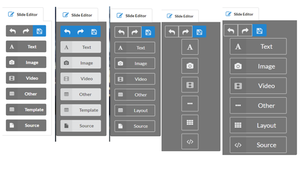
This is a screenshot of a mock-ed up bar. Currently playing around with the design so there are some options displayed below. Please provide comments, partcularly on colour scheme!


