This page is to capture notes from testing slidewiki.org on a smartphone and tablet device/emulator with links to resulting tasks.
Results from testing available in Deck / slide view on Mobile devices
| SlideWiki | iPad 3 Model MD367B/A Safari 601.1 Using device accessibility settings. | Nexus 5 Firefox 62.0.3. Device accessibility settings. | Pixel 2 | iPhone 6/7/8 Emulator in Chrome Version 69.0.3497.100 (Official Build: 64-bit) | iPad Emulator in Chrome Version 69.0.3497.100 (Official Build: 64-bit) | Actions & Jira tasks |
|---|---|---|---|---|---|---|
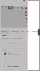
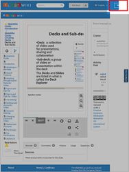
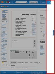
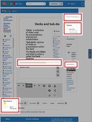
| Undefined (what displays when opening the website for the first time). | URL: Undefined Screen right: large white margin of unused screen space. When adjusting for this, ensure the Give Feedback button does not overlap critical text. See image for iPhone just different screen resolution for the Pixel 2. | URL: Undefined Screen right: large white margin of unused screen space. When adjusting for this, ensure the Give Feedback button does not overlap critical text. | URL: Decks and sub-deck help guide view Sign In button partially visible. Important: Generic issue found. Screen right: large white margin of unused screen space occurs on all help guides when undefined. The select language, creator and activity feed column is too narrow and needs to fill white space. Important: Generic issues found for all help guide decks when undefined:
| Fixed on mobile device but needs to be done via media query instead of browser detection | ||
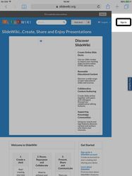
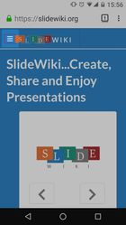
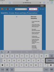
| Home page (not signed in) | URL: Homepage Important: Generic issue found. Screen right: large white margin of unused screen space. The featured decks column is too narrow and needs to fill white space. The button 'got it' next to this website uses cookies does not clear the message. Sign in button is not visible. The English language button also does not open. 'Open document', 'browse through existing slidewiki decks', '3. Present share and communicate' and the featured decks text overlap. 'throughexisting' needs to be 'through existing'. The featured decks icons cover critical text. The present, share and communicate icons are not labelled - VoiceOver does not read them aloud. The 'create a copy of a deck' icons can be navigated to by VoiceOver by moving focus, these need to be skipped. The featured decks icons are not labelled so VoicOver does not read them aloud. All elements can be reached by moving focus using VoiceOver. Invert colours can also be activated, although this does not provide customisable high contrast options. Unfortunately, the invert colours option prevents a screenshot of the inversion that takes place. Double tap with three finger zoom can be activated but does not allow a screenshot to be taken of the result. Switch control allows focus to be moved and selected as required. When 'group items' is activated in the accessibility settings it allows items on the web page to be grouped and for nested selections to take place within those groups. However, when reaching the start of the box entitled 'get started', the focus returns to the browser header bar rather than scanning to the next item and scrolling down the page until the footer can be reached. | URL: Homepage Recommend using: Android testing for accessibility Buttons (including burger menu) need to be a minimum of 12mm (45.4 pixels) Talkback reads aloud just 'button' and needs to specify left or right button. Magnification gesture with a triple tap allows website content to be magnified by the device and then fine-tuned with pinch gestures. Footer links are small. If zoom is force enabled within the Firefox browser this can be overcome. The system font size can be detected by the browser, but this option needs to be activated in the browser accessibility settings. Include font size buttons? Discover SlideWiki - swipe gestures are disabled over Create Online Slide Decks etc. Swiping is possible either side of this text. This may confuse the user. Icons, such as forking, can be reached by moving focus but nothing is read aloud by Talkback. This may confuse the user. When using Talkback skip the icons and read the headings etc, such as 'Create Copy of a deck'. There are no labels for the present, share and communicate icons. Spelling error found: 'The project involves 17 partners to develop...'project webiste' should be 'project website' on Find out about the SlideWiki project. Colour inversion is recognised allowing for white text on a black background. Certain parts of the site are shown with a blue background with black text. Unfortunately, no screenshot is possible as the colour inversion is not picked up in the screenshot. Provide high contrast settings on the website to allow for yellow text on a black background or dark blue text on a light blue background? Custom colours? Colour correction is recognised and changes the website for Deuteranomaly (red-green). Important: Switch Access Control is only able to scroll through the browser options up to the three-dot menu in the address bar. It is not possible to move the switch control focus into and then navigate within the website. No screenshot is available as the volume control buttons required for screenshots were mapped to the switch. This is recommended for developers. The only other way to demonstrate this is to use an external Bluetooth keyboard. | URL: Homepage Important: Generic issue found - ensure the Give Feedback button does not overlap critical text. The Give Feedback button overlaps critical text. | URL: Homepage Important: Generic issue found - ensure the Give Feedback button does not overlap critical text. The Give Feedback button overlaps critical text. | ||
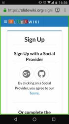
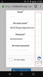
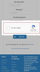
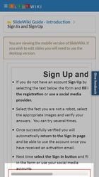
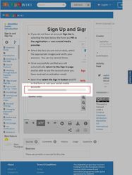
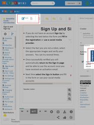
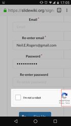
| Sign Up | URL: Sign Up The sign in button is not visible. Once the white space is selected where the sign in button should be the word 'sign in' appears. When selected by tapping on the screen or by double tapping when using VoiceOver the sign in dialogue box does not appear and the user is prevented from going any further. To get to the sign-up link the user has to go through the sign in dialogue box. On first visit can a link to sign-up appear instead of sign in? | URL: Sign Up Important: It is not possible to scroll down the Sign In dialogue box to reach the sign up link using swipe gestures. On occasion, the user is locked in the email field when moving focus. Important: The Sign Up form does not allow the user to move focus through swipe gestures within the Sign Up form. This can only be overcome by exploring the screen with touch. The user needs to be able to move from the webview into the Sign Up text and form. Once Sign Up is double tapped the user can then move focus through the Sign Up text and form. A screen reader user would not know where to double tap the screen for the Sign Up text. First name, last name, user name, email, re-enter email, password, re-enter password fields and the reCaptcha box overlap. Colour inversion is recognised allowing for white text on a black background. Certain parts of the site are shown with a blue background with black text. Unfortunately, no screenshot is possible as the colour inversion is not picked up in the screenshot. Provide high contrast settings on the website to allow for yellow text on a black background or dark blue text on a light blue background? Custom colours? Colour correction is recognised and changes the website for Deuteranomaly (red-green). | URL: Sign Up Sign up form requires font size buttons. Ensure all components on the page can be navigated to using gestures to move focus, particularly when navigating to the headphones for an audio reCaptcha. Ensure dialogue boxes or on-screen notifications can be read aloud by either Talkback on Android, VoiceOver on iOS and Narrator on Windows tablets. URL: Sign Up Help Guide The sign-up help guide requires horizontal scrolling when zoomed. Important: Generic issue found - this occurs across all the help guides. See image for iPhone just different screen resolution for the Pixel 2. View of help guide may need to provide two options, a view of the slide and a responsive view of the slide. The following help guide decks do not have image alt tags:
| URL: Sign Up Sign up form requires font size buttons. The reCaptcha box overlaps. Ensure all components on the page can be navigated to using gestures to move focus, particularly when navigating to the headphones for an audio reCaptcha. Ensure dialogue boxes or on-screen notifications can be read aloud by either Talkback on Android, VoiceOver on iOS and Narrator on Windows tablets. URL: Sign Up Help Guide The sign-up help guide requires horizontal scrolling when zoomed. Important: Generic issue found - this occurs across all the help guides. View of help guide may need to provide two options, a flat view of the slide and a responsive view of the slide. Ensure each deck view of the slide can be navigated by a screen reader and that the user can move focus from the rest of the website into the viewable area. The following help guide decks do not have image alt tags:
| URL: Sign Up - reCaptcha Sign up form requires font size buttons. Ensure all components on the page can be navigated to using gestures to move focus, particularly when navigating to the headphones for an audio reCaptcha. Ensure dialogue boxes or on-screen notifications can be read aloud by either Talkback on Android, VoiceOver on iOS and Narrator on Windows tablets. URL: Sign Up Help Guide Sign Up help guide requires horizontal scrolling when zoomed. Important: Generic issue found - this occurs across all the help guides. View of help guide may need to provide two options, a flat view of the slide and a responsive view of the slide. Ensure each deck view of the slide can be navigated by a screen reader and that the user can move focus from the rest of the website into the viewable area. The following help guide decks do not have image alt tags:
| |
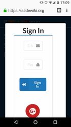
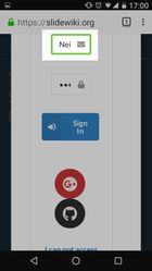
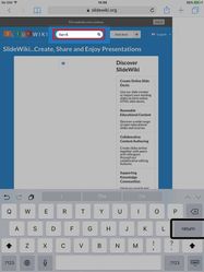
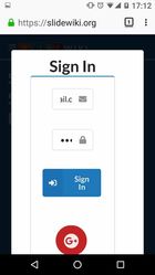
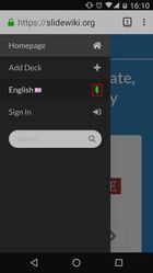
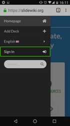
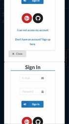
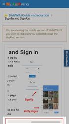
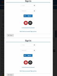
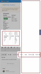
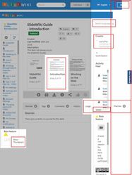
| Sign In | URL: Sign In Important: Generic issue found. Screen right: large white margin of unused screen space. The featured decks column is too narrow and needs to fill white space. The button 'got it' next to this website uses cookies does not clear the message. Sign in button is not visible. Once the white space is selected where the sign in button should be the word 'sign in' appears. When selected by tapping on the screen and by double tapping when using VoiceOver the sign in dialogue box does not appear and the user is prevented from going any further. The search bar, add deck and language selector can be navigated to using VoiceOver but the buttons prevent the user from going any further when selected or double tapped when using VoiceOver. eg. | URL: Sign In On sign in 'graphic' is read continually out loud by Talkback about 25 times. The sign in email and password fields are too small. It is difficult to read the email field and difficult to edit both the email and password field. It is not possible to move focus to the hamburger menu using Talkback. Important: Double tapping the Slidewiki Logo accesses the burger menu when using Talkback. The user will need to navigate using focus to the burger menu button. The side pop out menu is difficult to reach using Talkback to move focus. The user would be very confused even when in default mode in Talkback. Default mode reads every item on the screen when a swipe occurs. To overcome this the user will need to navigate to the burger menu icon by moving focus and then double tapping. This will then need to change focus to the menu items so that with a single swipe right the user will then be able to move through the side pop out menu options only. Once in the side pop out menu focus can be moved through each menu item, including the triangle next to the specified language 'English'. This does not read aloud, the other menu items skip the icons when using Talkback. Once sign-in is double tapped using Talkback, the email and password lock icons can be navigated to using Talkback, these need to be skipped. Two finger scroll using Talkback is not enabled in the Sign in dialogue box. The 'I can not access my account' and the 'Don't have an account? Sign up here' link can be navigated too using Talkback. Important: Switch access control focus can only reach 'Don't have an account? Sign up here'. It then scrolls through the browser address bar and options. It is not possible to provide a screenshot because the volume control buttons are remapped for switch control. This is recommended for developers. The only other way to demonstrate this is to use an external Bluetooth keyboard. Colour inversion is recognised allowing for white text on a black background. Certain parts of the site are shown with a blue background with black text. Unfortunately, no screenshot is possible as the colour inversion is not picked up in the screenshot. Provide high contrast settings on the website to allow for yellow text on a black background or dark blue text on a light blue background? Custom colours? Colour correction is recognised and changes the website for Deuteranomaly (red-green). | URL: Sign In Important: generic issue found. Sign In dialogue box duplicated. See image for iPhone just different screen resolution for the Pixel 2. URL: Sign In Help Guide Sign In help guide requires horizontal scrolling when zoomed. Important: Generic issue found - this occurs across all the help guides. See image for iPhone just different screen resolution for the Pixel 2. View of help guide may need to provide two options, a view of the slide and a responsive view of the slide. The following help guide decks do not have image alt tags:
| URL: Sign In Help Guide Sign In help guide requires horizontal scrolling when zoomed. Important: Generic issue found - this occurs across all the help guides. View of help guide may need to provide two options, a flat view of the slide and a responsive view of the slide. Ensure each deck view of the slide can be navigated by a screen reader and that the user can move focus from the rest of the website into the viewable area. Ensure all items within the viewable area of the deck are navigable by a screen reader. The following help guide decks do not have image alt tags:
| URL: Sign In duplicate dialogue box Important: generic issue found. Sign In dialogue box duplicated. URL: Sign In The give feedback button overlaps critical text. The edit controls when signed in for a tablet overlap. URL: Sign In Help Guide Sign In help guide requires horizontal scrolling when zoomed. Important: Generic issue found - this occurs across all the help guides. View of help guide may need to provide two options, a flat view of the slide and a responsive view of the slide. Ensure each deck view of the slide can be navigated by a screen reader and that the user can move focus from the rest of the website into the viewable area. The following help guide decks do not have image alt tags:
| Slide control bar needs to be responsive and concatenate - create task |
| Reset password | URL: Reset Password The sign in button is not visible. Once the white space is selected where the sign in button should be the word 'sign in' appears. When selected by tapping on the screen and by double tapping when using VoiceOver the sign in dialogue box does not appear and the user is prevented from going any further. To get to the reset password link the user has to go through the sign in dialogue box. | URL: Reset Password reCaptcha box overlaps. Important: When using Switch Control the reset password box cannot be navigated. Colour inversion is recognised allowing for white text on a black background. Certain parts of the site are shown with a blue background with black text. Unfortunately, no screenshot is possible as the colour inversion is not picked up in the screenshot. Provide high contrast settings on the website to allow for yellow text on a black background or dark blue text on a light blue background? Custom colours? Colour correction is recognised and changes the website for Deuteranomaly (red-green). | URL: Reset Password Ensure all components on the page can be navigated to using gestures to move focus, particularly when navigating to the headphones for an audio reCaptcha. | URL: Reset Password Ensure all components on the page can be navigated to using gestures to move focus, particularly when navigating to the headphones for an audio reCaptcha. | URL: Password Reset There is no notification provided when a password is reset. The following happens: The only way to continue is to refresh the page. The password changes. I was able to re-use my previous password. | Sweet alert on password change did not appear on a tablet
|
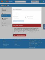
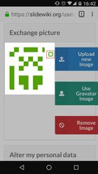
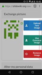
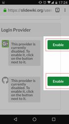
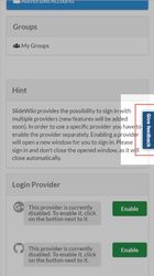
| Settings | URL: Settings Settings are not available on the homepage as a button or a link to select. | URL: Settings Important: After 'exchange picture' under 'profile' when moving focus Talkback reads out loud 'graphic diagram', and the word 'graphic' is repeated about 25 times by talkback for each swipe until it finally moves focus to 'upload new image'. The upload new image, use gravatar image and remove image overlap. Under 'authorized accounts - login provider' the green 'enable' buttons overlap. Important: When using Switch Control the personal settings cannot be navigated. Colour inversion is recognised allowing for white text on a black background. Certain parts of the site are shown with a blue background with black text. Unfortunately, no screenshot is possible as the colour inversion is not picked up in the screenshot. Provide high contrast settings on the website to allow for yellow text on a black background or dark blue text on a light blue background? Custom colours? Colour correction is recognised and changes the website for Deuteranomaly (red-green). | URL: Settings Important: Generic issue found - ensure the Give Feedback button does not overlap critical text. The give feedback button overlaps critical text. See image for iPhone just different screen resolution for the Pixel 2. | URL: Settings Important: Generic issue found - ensure the Give Feedback button does not overlap critical text. The give feedback button overlaps critical text. | ||
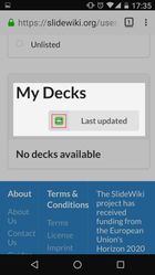
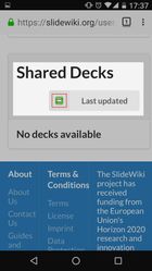
| Deck Folder | URL: Deck Folder The add deck can be navigated to using VoiceOver but the button prevents the user from going any further when selected or double tapped when using VoiceOver. This prevents access to the deck folder. | URL: Deck Folder Two-way arrow icon can be navigated to by moving focus for both 'My Decks' and 'Shared Decks'. This needs to be skipped by Talkback and move straight to 'last updated'. Important: When using Switch Control the personal settings cannot be navigated. Colour inversion is recognised allowing for white text on a black background. Certain parts of the site are shown with a blue background with black text. Unfortunately, no screenshot is possible as the colour inversion is not picked up in the screenshot. Provide high contrast settings on the website to allow for yellow text on a black background or dark blue text on a light blue background? Custom colours? Colour correction is recognised and changes the website for Deuteranomaly (red-green). | URL: Deck Folder SlideWiki Guide - Introduction.
See image for iPhone just different screen resolution for the Pixel 2. | URL: Deck Folder SlideWiki Guide - Introduction.
| URL: Deck Folder SlideWiki Guide - Introduction.
Important: The above are generic issues found, except that all other deck folder thumbnails do not have overlapping text. | This has been addressed by detecting mobile browsers but needs to be in responsive media queries |
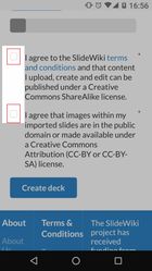
| Add Deck | URL: Add Deck The add deck can be navigated to using VoiceOver but the button prevents the user from going any further when selected or double tapped when using VoiceOver. Under featured decks, the wording 'no featured decks available'. | URL: Add Deck Important: Talkback is prevented from moving focus to the checkboxes for both of the 'I agree...' statements. Important: When using Switch Control the personal settings cannot be navigated. Colour inversion is recognised allowing for white text on a black background. Certain parts of the site are shown with a blue background with black text. Unfortunately, no screenshot is possible as the colour inversion is not picked up in the screenshot. Provide high contrast settings on the website to allow for yellow text on a black background or dark blue text on a light blue background? Custom colours? Colour correction is recognised and changes the website for Deuteranomaly (red-green). | URL: Add Deck Important: Generic issue found - ensure the Give Feedback button does not overlap critical text. Ensure all components on the page can be navigated to using gestures to move focus. | URL: Add Deck Important: Generic issue found - ensure the Give Feedback button does not overlap critical text. Ensure all components on the page can be navigated to using gestures to move focus. | URL: Add Deck Ensure all components on the page can be navigated to using gestures to move focus. | |
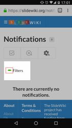
| Notifications | URL: Notifications Notifications are not available as there is no option to navigate to on the home page. | URL: Notifications All items can be navigated to using Talkback and moving focus. The triangle icon next to the word filters can be navigated to using Talkback, this needs to be skipped. Important: When using Switch Control the personal settings cannot be navigated, save for navigating to the icon triangle next to the word 'filters'. Colour inversion is recognised allowing for white text on a black background. Certain parts of the site are shown with a blue background with black text. Unfortunately, no screenshot is possible as the colour inversion is not picked up in the screenshot. Provide high contrast settings on the website to allow for yellow text on a black background or dark blue text on a light blue background? Custom colours? Colour correction is recognised and changes the website for Deuteranomaly (red-green). | URL: Notifications The Give Feedback button overlaps critical text in the footer. Ensure all components on the page can be navigated to using gestures to move focus. Ensure dialogue boxes or on-screen notifications can be read aloud by either Talkback on Android, VoiceOver on iOS and Narrator on Windows phone. | URL: Notifications The Give Feedback button overlaps critical text in the footer. Ensure all components on the page can be navigated to using gestures to move focus. Ensure dialogue boxes or on-screen notifications can be read aloud by either Talkback on Android, VoiceOver on iOS and Narrator on Windows phone. | URL: Notifications Ensure all components on the page can be navigated to using gestures to move focus. Ensure dialogue boxes or on-screen notifications can be read aloud by either Talkback on Android, VoiceOver on iOS and Narrator on Windows tablets. | |
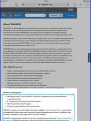
| About Us | URL: About Us Important: Generic issue found. Screen right: large white margin of unused screen space. The button 'got it' next to this website uses cookies does not clear the message. Sign in button is not visible. All elements can be reached by moving focus using VoiceOver. Invert colours can also be activated, although this does not provide customisable high contrast options. Unfortunately, the invert colours option prevents a screenshot of the inversion that takes place. Double tap with three finger zoom can be activated but does not allow a screenshot to be taken of the result. Switch control allows focus to be moved and selected as required. When 'group items' is activated in the accessibility settings it allows items on the web page to be grouped and for nested selections to take place within those groups. However, when reaching 'features coming soon', the focus returns to the browser header bar rather than scanning to the next item and scrolling down the page until the footer can be reached. | URL: About Us All items can be navigated to using Talkback and moving focus. Bullet points state the number of items in the unordered list. Important:Generic issue found - The Give Feedback button overlaps critical text. Important: When using Switch Control the About SlideWiki cannot be navigated. Colour inversion is recognised allowing for white text on a black background. Certain parts of the site are shown with a blue background with black text. Unfortunately, no screenshot is possible as the colour inversion is not picked up in the screenshot. Provide high contrast settings on the website to allow for yellow text on a black background or dark blue text on a light blue background? Custom colours? Colour correction is recognised and changes the website for Deuteranomaly (red-green). | URL: About Us Important: Generic issue found - The Give Feedback button overlaps critical text. | URL: About Us Important: Generic issue found - The Give Feedback button overlaps critical text. | ||
| Contact Us | URL: Contact Us Important: Generic issue found. Screen right: large white margin of unused screen space. The button 'got it' next to this website uses cookies does not clear the message. Sign in button is not visible. All elements can be reached by moving focus using VoiceOver. Invert colours can also be activated, although this does not provide customisable high contrast options. Unfortunately, the invert colours option prevents a screenshot of the inversion that takes place. Double tap with three finger zoom can be activated but does not allow a screenshot to be taken of the result. All elements can be navigated to using Switch Control. | URL: Contact Us All items can be navigated to using Talkback and moving focus. Important: Generic issue found - the Give Feedback button overlaps critical text. Important: When using Switch Control the Contact Us cannot be navigated. Colour inversion is recognised allowing for white text on a black background. Certain parts of the site are shown with a blue background with black text. Unfortunately, no screenshot is possible as the colour inversion is not picked up in the screenshot. Provide high contrast settings on the website to allow for yellow text on a black background or dark blue text on a light blue background? Custom colours? Colour correction is recognised and changes the website for Deuteranomaly (red-green). | URL: Contact Us Ensure all components on the page can be navigated to using gestures to move focus, particularly when navigating to the headphones for an audio reCaptcha. | URL: Contact Us Ensure all components on the page can be navigated to using gestures to move focus, particularly when navigating to the headphones for an audio reCaptcha. | URL: Contact Us Ensure all components on the page can be navigated to using gestures to move focus, particularly when navigating to the headphones for an audio reCaptcha. | |
| Guides and help | URL: Decks in Playlist When selecting or double tapping using VoiceOver the Guides and Help link in the footer give a timeout error message or does not respond. This prevents access to the decks playlist. | URL: Decks in Playlist All items can be navigated to using Talkback and moving focus. Important:Generic issue found - the Give Feedback button overlaps critical text. Important: When using Switch Control the guides and help cannot be navigated. Colour inversion is recognised allowing for white text on a black background. Certain parts of the site are shown with a blue background with black text. Unfortunately, no screenshot is possible as the colour inversion is not picked up in the screenshot. Provide high contrast settings on the website to allow for yellow text on a black background or dark blue text on a light blue background? Custom colours? Colour correction is recognised and changes the website for Deuteranomaly (red-green). | URL: Decks in Playlist Ensure all components on the page can be navigated to using gestures to move focus. Important: Generic issue found - ensure the Give Feedback button does not overlap critical text. | URL: Decks in Playlist Ensure all components on the page can be navigated to using gestures to move focus. Important: Generic issue found - ensure the Give Feedback button does not overlap critical text. | URL: Decks in Playlist Ensure all components on the page can be navigated to using gestures to move focus. | |
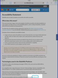
| Accessibility | URL: Accessibility Important: Generic issue found. Screen right: large white margin of unused screen space. The button 'got it' next to this website uses cookies does not clear the message. Sign in button is not visible. All elements can be reached by moving focus using VoiceOver. Invert colours can also be activated, although this does not provide customisable high contrast options. Unfortunately, the invert colours option prevents a screenshot of the inversion that takes place. Double tap with three finger zoom can be activated but does not allow a screenshot to be taken of the result. Switch control allows focus to be moved and selected as required. When 'group items' is activated in the accessibility settings it allows items on the web page to be grouped and for nested selections to take place within those groups. However, when reaching 'please contact us' under 'Technologies used in the SlideWiki Platform', the focus returns to the browser header bar rather than scanning to the next item and scrolling down the page until the footer can be reached. Also 'pleasecontact' needs to be 'please contact'. | URL: Accessibility All items can be navigated to using Talkback and moving focus. Important: Generic issue found - the Give Feedback button overlaps critical text. Important: When using Switch Control the accessibility statement cannot be navigated. Colour inversion is recognised allowing for white text on a black background. Certain parts of the site are shown with a blue background with black text. Unfortunately, no screenshot is possible as the colour inversion is not picked up in the screenshot. Provide high contrast settings on the website to allow for yellow text on a black background or dark blue text on a light blue background? Custom colours? Colour correction is recognised and changes the website for Deuteranomaly (red-green). | URL: Accessibility Important: Generic issue found - the Give Feedback button overlaps critical text. | URL: Accessibility Important: Generic issue found - the Give Feedback button overlaps critical text. | ||
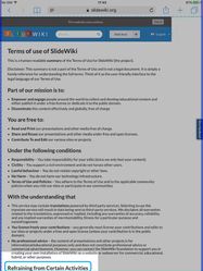
| Terms | URL: Terms Important: Generic issue found. Screen right: large white margin of unused screen space. The button 'got it' next to this website uses cookies does not clear the message. Sign in button is not visible. All elements can be reached by moving focus using VoiceOver. Invert colours can also be activated, although this does not provide customisable high contrast options. Unfortunately, the invert colours option prevents a screenshot of the inversion that takes place. Double tap with three finger zoom can be activated but does not allow a screenshot to be taken of the result. Switch control allows focus to be moved and selected as required. When 'group items' is activated in the accessibility settings it allows items on the web page to be grouped and for nested selections to take place within those groups. However, when reaching 'refraining from certain activities', the focus returns to the browser header bar rather than scanning to the next item and scrolling down the page until the footer can be reached. | URL: Terms All items can be navigated to using Talkback and moving focus. Important: Generic issue found - the Give Feedback button overlaps critical text. Important: When using Switch Control the Terms cannot be navigated. Colour inversion is recognised allowing for white text on a black background. Certain parts of the site are shown with a blue background with black text. Unfortunately, no screenshot is possible as the colour inversion is not picked up in the screenshot. Provide high contrast settings on the website to allow for yellow text on a black background or dark blue text on a light blue background? Custom colours? Colour correction is recognised and changes the website for Deuteranomaly (red-green). | URL: Terms Important: Generic issue found - the Give Feedback button overlaps critical text. | URL: Terms Important: Generic issue found - the Give Feedback button overlaps critical text. | ||
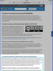
| License | URL: License Important: Generic issue found. Screen right: large white margin of unused screen space. The button 'got it' next to this website uses cookies does not clear the message. Sign in button is not visible. All elements can be reached by moving focus using VoiceOver. Invert colours can also be activated, although this does not provide customisable high contrast options. Unfortunately, the invert colours option prevents a screenshot of the inversion that takes place. Double tap with three finger zoom can be activated but does not allow a screenshot to be taken of the result. Switch control allows focus to be moved and selected as required. When 'group items' is activated in the accessibility settings it allows items on the web page to be grouped and for nested selections to take place within those groups. However, when reaching 'Can I add any materials to my slides...', the focus returns to the browser header bar rather than scanning to the next item and scrolling down the page until the footer can be reached. | URL: License All items can be navigated to using Talkback and moving focus. Important: Generic issue found - the Give Feedback button overlaps critical text. Important: When using Switch Control the License cannot be navigated. Colour inversion is recognised allowing for white text on a black background. Certain parts of the site are shown with a blue background with black text. Unfortunately, no screenshot is possible as the colour inversion is not picked up in the screenshot. Provide high contrast settings on the website to allow for yellow text on a black background or dark blue text on a light blue background? Custom colours? Colour correction is recognised and changes the website for Deuteranomaly (red-green). | URL: License Important: Generic issue found - the Give Feedback button overlaps critical text. | URL: License Important: Generic issue found - the Give Feedback button overlaps critical text. |
Known issues:
| SlideWiki | iPad 3 Model MD367B/A Safari 601.1. Using device accessibility settings. | Nexus 5 Using Firefox (mobile) 62.0.3. Using device accessibility settings. | Pixel 2 emulator in Chrome Version 69.0.3497.100 (Official Build) (64-bit) | iPhone 6/7/8 emulator in Chrome Version 69.0.3497.100 (Official Build) (64-bit) | iPad emulator in Chrome Version 69.0.3497.100 (Official Build) (64-bit) | Action & Jira tasks |
|---|---|---|---|---|---|---|
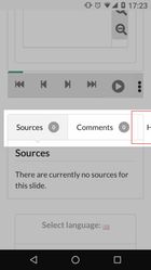
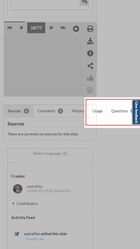
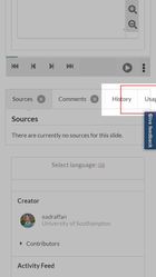
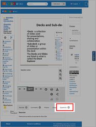
Deckview - tools content below the slide | The decks could not be viewed so it was not possible to check if the tab labels overflowed. | Important: Generic issue found - tab labels overflow. | Important: Generic issue found - tab labels overflow fractionally when undefined and when signed in. Ensure feedback button does not overlap critical text. | Important: Generic issue found - tab labels overflow when undefined. Ensure feedback button does not overlap critical text. Tab labels overflow when signed in. | Important: Generic issue found - tab labels overflow | SWIK-442 - Getting issue details... STATUS |
